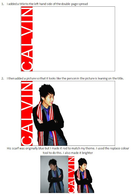
I have definitely learnt more about Fireworks than I knew already, for example I learnt how to change the exising colours of a photograph using the re-colour tool which i used to change the colour of a scalf to better suite the colour scheme of my magazine.
I also learnt a lot about magazine layouts and styles which helped alot when it came to designig my magazine front cover. I leant what colours go together and what font’s suit those colours and I also learnt that less is more. My research taught me more about music magazines and music genres.
Saturday, 12 December 2009
What have I learnt about technologies from the process of constructing this product?
As I only used Fireworks I learnt a lot of new things about the software. Although I already had a good knowledge of the software I did learn how to adjust picture brightness and contrast and how to edit pictures faster. I also have become faster at using Fireworks by becoming familiar with the shortcuts and tools which in the future should be very useful.
Unfortunately my front page became corrupted and i no longer had access to edit or even view my front page. This showed me that it is important to back up work even if you don't feel the need to. Luckily i had a print screen of my work and i had already showed my editing process so i used that in my blog.
Unfortunately my front page became corrupted and i no longer had access to edit or even view my front page. This showed me that it is important to back up work even if you don't feel the need to. Luckily i had a print screen of my work and i had already showed my editing process so i used that in my blog.
Who would be the audience for my media product?
My audience would be people aged 15-25. Females more so then men because within the pop genre there are a lot of boy bands and male artists. Lower to middle class people. White people and Asian people. They should be interested in music, and probably be in education (school, college, university) The audience was good because i am part of the pop audience and i know what i would look for in a magazine. I also gave out questionnaires to people who fit my audience specification so that i could have a clearer view on what they want from a music magazine.
How did I attract or address my audience?
I attracted my audience by creating a vivid and bold front cover, the colour scheme consists of two main colours; red & black, this ensures that the design stands out amongst others. I aimed my magazine at people aged 15 - 25 so I had to keep the style young and up to date. I used simple colours and kept them bold and vibrant. In the end I used red as a main colour because it is very deep and stands out. I used simple modern fonts to make it easy to read and stylish. The language I used was informal so my target audience could relate to it more.
In what way does my media product use, develop or challenge forms and conventions of real media?
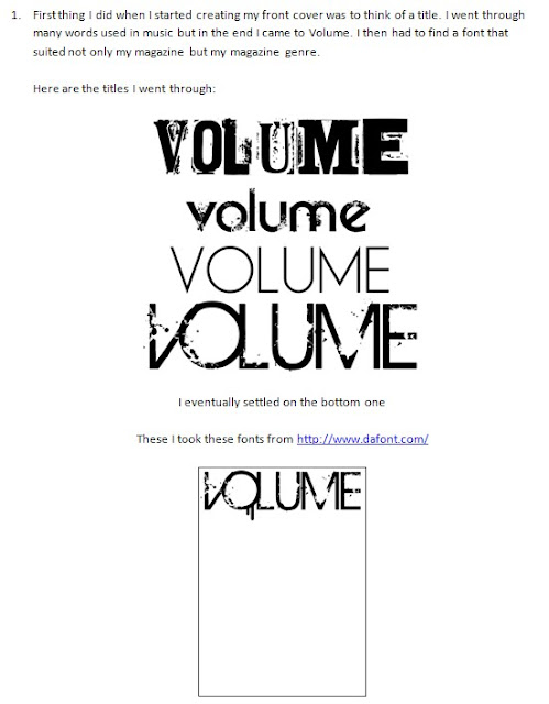
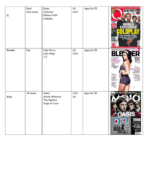
My magazine contains many different elements. I used large simple font to catch the reader’s attention and to be easy to read. I also stuck to a simple colour scheme (red, white and black) to keep a constant theme. My layout was simple so it’s not overcrowded and keeps with my main theme of simplicity and bright colours. Also the language I used is informal to make my audience relate to it more. I looked at the “BLENDER” magazine and “NME” magazine for inspiration and I found that blender helped a lot when doing my front cover.
This is one of the magazines I used. The simple black and white wrighting with a splash of colour was very eye catching so I thought I would use the same technique on my front cover. However I decided not to use a real picture on the front cover to attract my audience. I edited the image to make it more enticing to the reader and therefore lead to them buying the magazine.
This is one of the magazines I used. The simple black and white wrighting with a splash of colour was very eye catching so I thought I would use the same technique on my front cover. However I decided not to use a real picture on the front cover to attract my audience. I edited the image to make it more enticing to the reader and therefore lead to them buying the magazine.
Friday, 11 December 2009
How did I attract or address my audience?
I attracted my audience by creating a vivid and bold front cover, the colour scheme consists of two main colours; red & black, this ensures that the design stands out amongst others. I settled on a colour scheme after viewing a range of music magazines. I used a simple layout to avoid cluttering the front page and i also used a hidden picture on the front to entice the coustomer.
Monday, 30 November 2009
Monday, 23 November 2009
Questionnaire results
The results from my final questionnaire shows that my magazine should have a simple front cover. It should be bright and colourful. There should be a picture of an artist or band on the front and there should be a good amount of information. E.g. puffs, titles
Final Questionnaire
My original questionnaire did not ask the right questions so I made this one which is aimed more to the style of magazine than the contents.
Questionnaire
The genre of my magazine is POP so therefore my questionnaire will be asking questions directed to that genre.
1. What kind of layout would be best for my chosen genre?
• Simple
• Packed
2. Colour scheme for my chosen genre? (you can tick more than one)
• Bright
• Dull
• Colourful
• Plain
• Dark
• Neutral
3. What would you like to see on the front cover?
• An artist or band?
• Musical instruments?
• Picture from a tour or concert?
4. How much information do you feel is needed on the front cover?
• Basics? E.g. Title, few puffs,
• Detail? E.g. Title, loads of puffs, subheadings
• Too much? E.g. Title, loads of puffs, subheadings, pictures for subheadings
Questionnaire
Questionnaire
Please circle you answer
Do you enjoy listening to music? YES NO
Do you read music magazines? YES NO
If yes which one/ones............................................................................................
What is your favourite music genre? (Circle as many as you like)
Pop Rock Hip-Hop Rap Indie Classic
Techno Jazz Metal Blues Punk Country
Do you have a favourite artist?
If so please give their name……………………………………………………………………………….
If you’re favourite artist was on the front of a magazine
Would you buy it? YES NO
Moodboard
from my moodboard you can see the bold use of bright colours. also the people in the pop industry are stylish, attractive and well dressed so if I wanted to create my own magazine I would have to use all that in my magazine. graphics are also a large part of the pop industry and music videos
the use of animation and SFX in these two pop music videos are an example of the style used in pop
My Magazine Genre
For my magazine I decided to base my magazine on my favourite genre of music, pop. I chose this because I know allot of pop artists and songs and I have a passion for the pop genre. If I picked a genre of music that I did not like I think my magazine would not be as successful.
Subscribe to:
Comments (Atom)


